
This guide is available as a video:


WizardPanel for WHMCS comes with our exclusive options panel. With WizardPanel you can easily add/edit your plans, adjust display options, enable/disable features/pages & more without any HTML experience.
Where can I find the options panel?
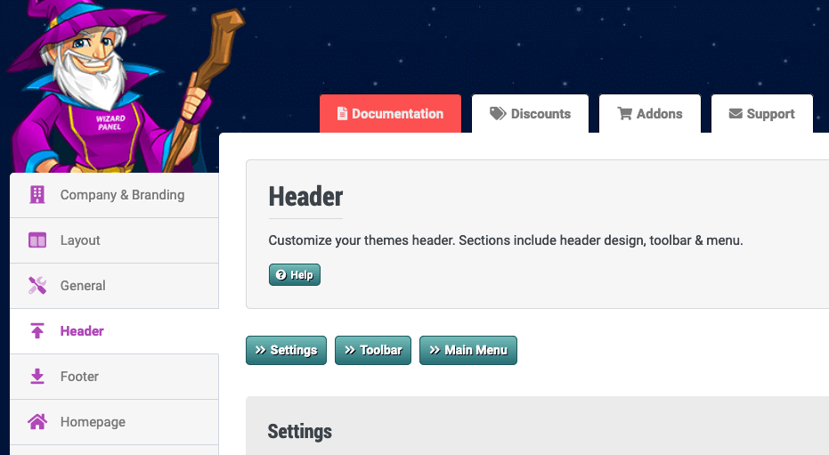
Once WizardPanel has been installed you'll be able to access the options panel from inside your WHMCS admin panel under Addons > WizardPanel as seen below:

Options Panel Tabs
Below is a list of each settings and what they are for:
Company & Branding
Company Logo Set your company logo here. Your logo will be used within the header of your design. Aside from your logo image you can also set alt text (for SEO), width and spacing. Your logo file should be in proportion and we recommend removing any blank space within the image. The width sets the max width of your logo so this allows you to control the size. The spacing allows you to add optional spacing around the header logo. If you set the Company Logo to off the design will use your Company Name as set in WHMCS.
Favicon Set your favicon here. This is a icon that will be displayed within the browser bar of your website.
Designs
WizardPanel includes multiple professionally designed layouts known as Designs. Unlike traditional WHMCS Templates, Designs work alongside the WizardPanel Framework, allowing you to change the appearance of your website without changing the underlying framework. Each Design includes its own recommended display settings to help achieve the appearance shown in the live demo. To apply these settings, navigate to the Designs tab and click the Import Design Defaults button. This will update design-related display settings such as colours, layouts and styling options while preserving your content, pages, menus, settings and license information. After importing the defaults, all settings can be further customised through the Options Panel to create a unique appearance tailored to your business.
Layout
LayoutSet the layout style of your design. The boxed layout centers your content within a box with spacing to the left and right. Full Width will use the full width of the screen.
ContainerThe design uses default values for the width and max width for both the Boxed & Full Width layouts. You can optionally override these values here.
Text SizesOverride the default text size and line height (defaults shown in grey).
SpacingCustomize the default spacing used within the design. The parent spacing is used for main elements, the child spacing is used for sub elements and inner is used for the spacing within boxes.
MiscSet the default border radius used by all elements of the design. The border radius created rounded corners, 0 will remove this in replacement of square corners. Some designs use a 3D effect by adding a thicker bottom border of elements. You can remove this by setting the Bottom Border Width to 1px.
General
AnimationEnable/disable animation throughout the design. When enabled elements of the design will animate (move) as the page loads and/or during scrolling.
Back To Top ButtonWhen enabled a small icon will show on the bottom right of the design during scrolling. When clicked this icon will return the user to the top of the page.
Icons (Font Awesome)Our designs use the Font Awesome CSS framework to display icons throughout the design (for example order buttons). Set to off to remove all icons. You may also need to set this option to off if another plugin using Font Awesome causes a conflict with the icon display.
Header
Header DesignSet the default design of the header. Header 1 aligns the logo and menu on the same row. Header 2 has the menu on a second row with the logo and header buttons on the top row. When Header 2 is enabled you will find the Header Buttons within this tab.
Toolbar DisplayEnable/disable the toolbar of the design (bar displayed at the top of all pages). This feature is important for Software Integration, we recommend keeping this on.
Toolbar TextThe text is displayed at the left side of the toolbar. Customize the text here or remove it by setting to off.
Menu DesignSet your design of the main menu. The design supports a mega menu and dropdown design. The mega menu uses buttons with descriptions and also a main dropdown description to the right. The dropdown uses basic links within a dropdown box. You can also set links to not use a dropdown by removing sub-links on the menus page.
Sticky MenuWhen enabled the menu will stick to the top of the browser when scrolling.
Home ButtonWhen enabled a home icon will show at the start of the menu using the set Font Awesome icon. You may decide to turn this off if for example you want a text based home link for your menu.
CTA ButtonDisplays a bold Call To Action button at the right of the menu. This is a great way to display your most important page or action (such as directing users to the cart). You can leave the icon blank to remove it. By default the #software_url_cart URL will link to your Software Integration cart.
Header ButtonsDisplay up to 5 buttons within the header. Each button can be used to link to important areas of your website using a clean design. Each button supports both text, an icon and animation. Note: These buttons are only used when the header design is set to 2.
Footer
CTADisplays a Call To Action bar at the footer. You can set this bar to on (displays on all pages), home (displays on the homepage only) or off. The CTA bar supports a background image/color, text button and more.
PartnersDisplay a partners image at the bottom of all pages. This is a great place to show off the software used by the services you provide.
Link BlocksThe link blocks are the grey block used within the 4th footer column. You can use these as you choose, by default the design uses them to display your company contact information. While editable in Wizard Panel this section is displayed as a Widget within the Widgets page of WHMCS.
Copyright TextSet your copyright text here.
Link To ZomexWe've made it easy for you to instantly remove the single link to Zomex found in the footer of your design. Should you choose to do so we would greatly appreciate a donation so we can continue to develop awesome designs with user friendly settings such as this one.

Legal ImagesThe legal images section is displayed at the very bottom of the design. Upload up to 3 images here to show off your credentials/payment providers.
Homepage
Slider
Display SliderTurn on/off the homepage slider.
Number Of SlidesThe slider supports up to 10 slides. Each enabled slide will display a button where you can jump to the content of that slide.
AutoEnable this setting to have the slider auto play upon load.
Infinite LoopEnable this setting to have the slider loop slides.
Pause TimeSet the pause time (milliseconds) between slides.
SpeedSet the transition speed (milliseconds) of slides.
PagerEnable the slider pager (small circle icons under the slider).
Adaptive HeightWhen enabled each slide will change to its content height.
Random StartWhen enabled the starting slide will be random.
Slider Content
DisplayEnable/display the slider.
HeadingSet your slide heading.
TextSet your slide text.
FeaturesSet up to 6 features within the slide. The features support Font Awesome icons. You can leave the icon blank to remove icons and even leave the feature itself blank to remove it from display.
BackgroundSet a background image and/or color for the slide. The background opacity is used to display a transparent layout over the background image. This is used to allow you to control the contrast between the background and text.
PricingSet a price for the service you are promoting. Your currency prefix and suffix will be used from the Products/Services tab. The price supports text and a term.
ImageDisplay a image which is displayed on the right of the slide. With screenshot set to on a browser design will be used for the image (designed for using screenshots). When set to off the slide will adapt to fill the image space making it one column.
VideoTurning this setting to on will display a badge within the banner image. Both the badge and image will display a video popup. For this to work you must set the image URL to a video such as from YouTube or Vimeo.
ButtonsEach slide supports 2 buttons. The buttons support text, and icon and URL. You can leave the button text blank to remove either button.
Domain Search
DisplayEnable/disable the domain search section which is displayed on the homepage under the slider.
HeadingSet the heading for the Domain Checker.
Sub HeadingSet the sub heading for the Domain Checker.
Domain SearchEnable or disable the domain search form and edit the placeholder and button text. The domain search form will only be displayed if you have a supported software enabled within the Software Integration tab (such as WHMCS).
TLDsDisplay up to 5 TLDs including the TLD, pricing, term and display order.
IntroductionThe introduction is displayed on the homepage below the domain search. This textarea allows you to add content to display within this section. By default the design uses this area as a way to describe the company's services.
Feature Boxes
DisplaySet the amount of feature boxes to display. The feature boxes allow you to display your products/services or website sections using a bold and professional boxes display.
ColumnsSet how many boxes display per row. The default value is 3.
Content AboveAdd optional content above the Feature Boxes.
Content BelowAdd optional content below the Feature Boxes.
Feature Boxes Content
NameSet the name of the box.
DescriptionSet the box description.
FeaturesSet features or bullet points for the box. This is a great way to show off the features of your product/service. The [b] tabs set the feature as bold using the primary color of the design. You can also leave features blank to remove them.
HighlightWhen a highlight is set the box will display a ribbon on the top right and also use a bolder color scheme for the box. Supported highlights are hot, popular, new & free.
PricingSet the price of the product/service you are promoting. Leaving either option blank will remove it from display.
ButtonsEach box supports the display of 2 buttons. By default we use these for Learn More & Order Now. Each button supports text, an Font Awesome icon and URL. The Learn More buttons link to the page in WHMCS and the Order Now buttons will link to the cart of your Software Integration. You should replace these links with direct shopping cart links as explained in our Linking Your Plans To The Software guide.
Pages
Within this tab you can turn on/off pages within your website and also change the display order. Aside from turning on/off individual pages you can also remove full categories and features. The Extras pages are WHMCS Marketconnect services which you may or may not have active in WHMCS. These pages will only display in the design if set to on in WizardPanel and are also activated within your WHMCS. Some of these settings also control functionality. For example if you turn of the Register Domain page it will also remove the domain search section underneath the homepage banner.
Products & Services
Quick SetupWe have 2 options for setting up your website which are quick setup turned on or off. When turned on your website will pull your product/service categories and plans from WHMCS and display them dynamically. When turned off your website will display 10 sales pages that are fully customizable in the options panel. These pages allow you to add your plans to be displayed in multiple ways to create engaging sales pages. These sales pages allow you to better display and promote the benefits of your products/services.
Unsure which option is best? Compare
CurrencyYour set currency (e.g $) will display before pricing used within the design. This includes anywhere your plans are displayed such as the slider, and plan displaying HTML Snippets (pricing tables, product slider, product boxes etc).
Currency SuffixThe currency suffix (e.g USD) will show after your pricing in the same places.
Check IconThe check icon is used for various comparison elements including the pricing tables & product slider. You can customize the Font Awesome icon and color here.
Cross IconThe cross icon is used for various comparison elements including the pricing tables & product slider. You can customize the Font Awesome icon and color here.
Service Pages - 10 sales pages when quicksetup is turned off
With Quick Setup turned off the design will support up to 10 customizable sales page. These pages support multiple layouts to display your products/services and allow you to add diverse content and SEO data. Each page can be made unique to the product or service you are providing. For example you could use a table layout for shared hosting and a slider layout for servers. You can re-name these pages to list any type of products/services you like by following this guide, for example if you don't provide Reseller Hosting you could always change this to Windows Hosting for example.
Can't see the hosting pages in WizardPanel? Ensure that the Quick Setup setting is turned off in the Quick Setup tab.
Page Title - Set the name of your page.
Page URL - This needs to be the name of your page without the .php extension. This URL is used within the design for links to the page such as within the main menu.
Layout Option - Change the layout style you'd like to use for displaying your products/services. Our templates support 4 layout options:
- table - pricing table design allowing you to easily compare up to 6 diverse products
- table2 - data table design which is perfect for listing up to 10 products with only a few varying features
- boxes - popular box design which is bold and easy to display up to 10 products effectively
- slider - a modern plan display allowing users to slide to compare between plans
Number Of Plans - Choose to display between 1 and 10 products/services for each page. The table layout supports a maximum of 6 plans but the others support up to 10.
Plan Settings - Using your selected layout you will be able to input your plan names, description, features, pricing & order URLs. We recommend reading our full guide on adding your plans.
Color Scheme
Color Scheme - Instantly set the default color scheme of your website between light and dark.
Toggle Switch - When set to on a color scheme toggle will display on the bottom left of your website allowing users to switch between the light and dark color schemes.
Multi-Language Support
Multi-Language Support - Set your multi-language setting, options are on, Google Translate and off.
- on - When set to on the native WHMCS multi-language support will be used. This system pulls each string of text from a single file e.g english.php. There is a unique file for each language supported by WHMCS which contains the translations Our designs support the same system with all of the text not editable via WizardPanel pulled from a single english.php file. While the design supports multi-languages please keep in mind that we don't provide translations (why not?).
- google - When enabled Google Translate service will be used, a translate button will show in your designs toolbar allowing users to select their language. Google will translate your default text used in the template on demand.
- off - No language button will be displayed on your website. In this case only the language file of your active language will be used (e.g english.php).
SEO
This tab will allow you to set the SEO data for each individual page of your website.
Page Title - The page title you set for each page is the first thing Google see when they crawl your site. It's also shown at the top of most browsers and on many occasions used for the listing of this page in Google. The page title is known as one of the most important aspects of on-page SEO so it's wise to edit this specifically for your business.
Meta Description - The meta description you set for each page is listed in the source code. It's used specifically for search engines to understand the content/focus of the particular page of your website. Search engines will sometimes use your defined description within your website listing in their results.
Meta Tags - In the early days of the web search engines such as Google used the tags as a way of ranking a page. As it was easily abused it's no longer used by Google for the ranking of a website. However we have left it as an option as some find it useful to list keywords for their own reference.
Social
SocialEnable/disable social media throughout the design.
Social DisplayEnable/disable a social profile. Our designs support over 30 different social networks.
Social URLSet the URL of your social profile. This URL will be used for all social buttons within the design.
Social Add To FooterSet to on to display this social profile within the footer of your design. This will be displayed as a clickable icon.
Social Add To Side WidgetSet to on to display this social profile within the side widget of your design. This will be displayed as a clickable icon.
Social Display OrderThis setting allows you to change the display order of a social profile. You will need to change this value for all of your enabled profiles.
WHMCS
Client Area MenuSet the display of the logged-in menu.
Slimmed Down LoginMuch like the slimmed down cart this setting will remove the clutter from the login page leaving just a simple login box + legal links. When enabled the slimmed down display creates a more web 2.0 look and will give your website a more member feel when clients login.
Slimmed Down CartWhen enabled your cart.php pages in the template will be minimal with the distracting elements in the header/footer (such as the mega menu, footer links etc) removed. With this setting enabled you should see a higher conversation rate. Many of the biggest websites will do the same when checking out. Turning this setting off will re-apply the full header/footer to the cart.php pages.
HTML Snippets
This tab includes a wide selection of ready-made HTML Snippets allowing you to easily generate pre-integrated and fully responsive elements for your new pages. Elements include feature boxes, pricing tables, buttons & more.
Make Money With Zomex
Earn commissions by promoting our products/services within the design. By default we list our products/services via the pages within the Addons dropdown of the main menu. To remove this feature simply turn off addons in the Pages tab.
Affiliate IDSet your Zomex affiliate ID. This will be instantly applied to all of URLs within the addons pages. You will now earn a commission from any sales generated from these pages of your website.
System
License KeyAdd your license key to activate your website. This key will be found within your Zomex.com account and also your order confirmation email.
License StatusDisplays the status of your license. You can manage your license from within your Zomex.com account including the ability to re-issue your license if you change your domain.
Licensed ToThe name/company name of your Zomex.com account that contains your license.
Sticky SaveFixes a save button to the bottom right of the screen, allowing you to save settings while scrolling.
Scroll To TopDisplays a back to top icon in the bottom right upon scrolling.
Reset Settings to DefaultWarning: This will reset all WizardPanel settings to default.
Uninstall WizardPanelWarning: This will remove all WizardPanel settings from your WHMCS database.
Addons
View our full range of WizardPanel for WHMCS addons.
Request Support
We hope you found this documentation useful. If you run into any issues we will be happy to assist you.